Graphing Data Read from a Data File
The following examples illustrate how to read a simple data file and produce a plot.
Contents
plot11A.m - Graphing Data Read from a Data File
This first example uses the load() command to read a file run1.txt and store its contents in a matrix. The file contains three columns of data: (1) independent variable, (2) dependent variable (3) error bar for each data point:
0	0.7	0.9
0.5	0.3	0.5
1	1.6	0.7
1.5	2.5	0.8
2	1.5	0.6
2.5	3.1	1.5
3	4.5	0.8
3.5	3.6	0.99
4	5.7	0.9
4.5	4.3	1.3
5	6.8	0.8
5.5	7.9	1.2
6	5.7	1.4
6.5	7.4	0.9
7	8.3	0.8
7.5	7.6	1.1
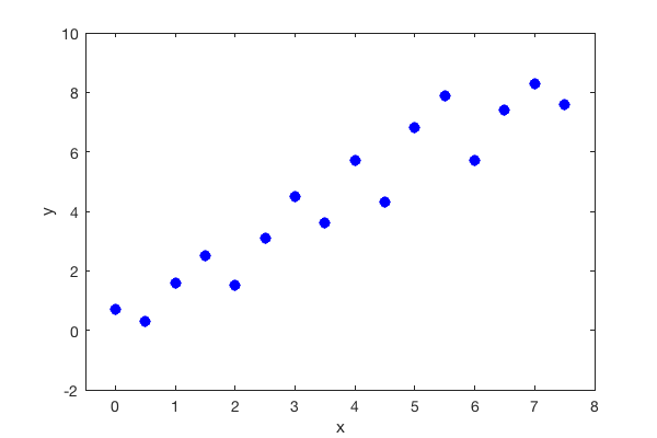
In this first example, we graph the second column (dependend variable) against the first column (independent variable) ignoring the error bars for now:
data = load('run1.txt');  % read in the data file
x = data(:,1);            % extract x values from 1st column
y = data(:,2);            % extract y values from 2nd column

% plot data
plot(x,y,'bo','MarkerFaceColor','b')

% Label axes
xlabel('x')
ylabel('y')

% Set axis limits for plot
xlim([-0.5 8])            % x axis goes from 0 to 4 pi
ylim([-2 10]);            % y axis goes from -4 to 4

plot11B.m - Adding Error Bars
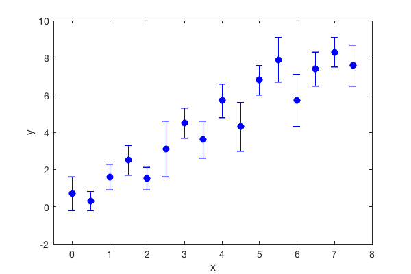
To add error bars, we replace the plot() command with the errorbar() command. It takes the same arguments as the plot() command, except the third argument is the size of the errorbar for each data point.
data = load('run1.txt');  % read in the data file
x = data(:,1);            % extract x values from 1st column
y = data(:,2);            % extract y values from 2nd column
err = data(:,3);          % extract error bars from 3rd column

% plot data points with error bars
errorbar(x,y,err,'bo','MarkerFaceColor','b');

% Label axes and give title
xlabel('x')
ylabel('y')

% Set axis limits for plot
xlim([-0.5 8])              % x axis goes from 0 to 4 pi
ylim([-2 10]);               % y axis goes from -4 to 4

plot11C.m - Adding a Reference Curve
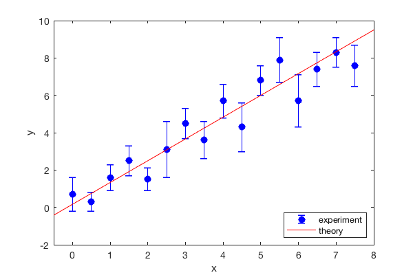
Suppose our theory predicted a linear relationship between the dependent and independent variables. As a third eample, we draw a red line on the graph to show how one might add a theoretical (or reference) line for comparison:
data = load('run1.txt');  % read in the data file
x = data(:,1);            % extract x values from 1st column
y = data(:,2);            % extract y values from 2nd column
err = data(:,3);          % extract error bars from 3rd column

% plot data points with error bars
errorbar(x,y,err,'bo','MarkerFaceColor','b');

% plot reference line
hold on
plot([-1 8], [-1 9.5], 'r-')

% Label axes and give title
xlabel('x')
ylabel('y')

% Set axis limits for plot
xlim([-0.5 8])              % x axis goes from 0 to 4 pi
ylim([-2 10]);               % y axis goes from -4 to 4

% add a lengnd in the lower-right corner
legend({'experiment', 'theory'}, 'location','southeast')

To draw the comparison line, we provide the (x,y) coordinates for the end points of the line segment we want to draw. In this example, the left side has coordinates (x1, y1) = (-1,-1) and the right side has coordinates (x2,y2) = (8,9.5). We group the x coordinates together in a matrix [x1 x2] = [-1 8]. Similarly we group the y values together [y1 y2] = [-1 9.5]. Then we pass these two matrices to the plot command like this
plot([-1 8], [-1 9.5], 'r-')
We also include a legend in the lower-right corner. Normally, the legend appears in the upper right-hand corder. However, since there are data points there, we need to relocate it. We use the 'location' specifier and tell Matlab to put the legend in the southeast corner (i.e. lower right). When using this specifier, we need to group the two labels (i.e. 'theory' and 'experiment') with curly brackets.
