
Contents
plot02.m - Plotting y = sin(x)
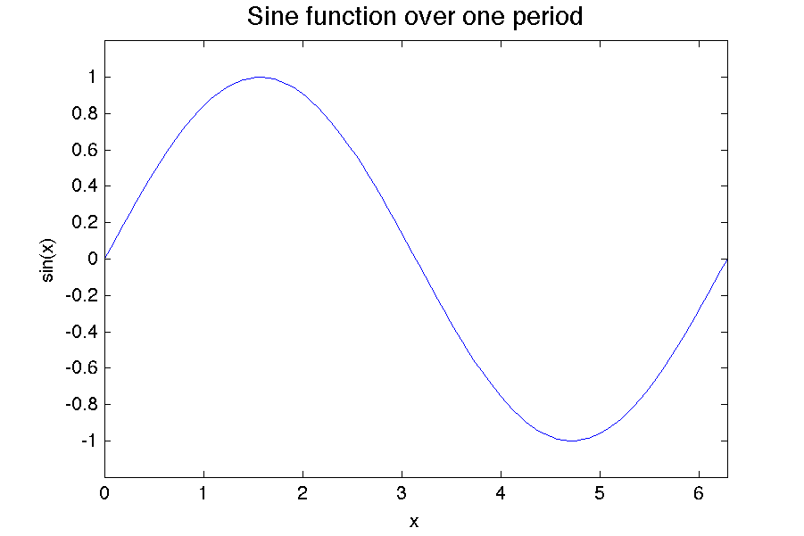
x = linspace(0,2*pi,100);    % define 100 x values from 0 to 2 pi
y = sin(x);                  % calculate sin(x)
plot(x,y)                    % plot y vs. x

% set the plot limits on the x and y axes
xlim([0, 2*pi]);
ylim([-1.2, 1.2]);

% label x and y axes and give the plot a title
xlabel('\theta')
ylabel('Sin(\theta)')
title('Sine function over one period', 'FontSize',14)
This example plots sin(x) vs. x. The linspace(0,2*pi,100) command is used to create an array of 100 points evenly distributed from 0 to 2*pi.
The commands xlim() and ylim() are used to specify the limits of the x (horizontal) and y (vertical) axes. Each of these functions expects a 1x2 or a 2x1 vector that contains the lower and upper limits respectively. For example in the code above the x limits are specified as
xlim([0, 2*pi]);
The comma is not necessary, so the following command also works:
xlim([0 2*pi]);
However, the comma is recommended for beginning programmers as it produces more robust code. For example if you accidently put in an extra space around the asterisk the command xlim([0, 2 *pi]); would be fine, however the command xlim([0 2 *pi]); would give an error because [0 2 *pi] would be interepreted as a 1x3 matrix and the element *3 does not make sense.
For those of you that like compact code, you can also replace the xlim() and ylim() commands with a single axis command. The axis command expects a 1x4 or a 4x1 array containing the min and max x values followed by the min and max y values. So, in this example, you could replace xlim() and ylim() commands with
axis([0, 2*pi, -1.2, 1.2]);
or
axis([0 2*pi -1.2 1.2]);
if you prefer elegance and don't mind slighly more error-prone syntax.
Leaving off the xlim and ylim commands
Try commenting out the xlim and ylim statements and see what happens. Your plot should look like the following
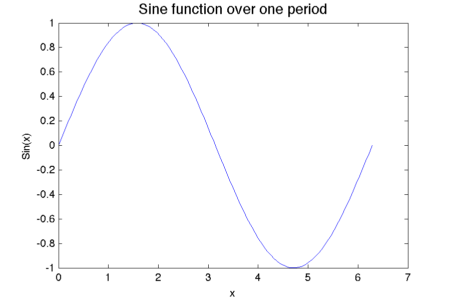
Notice that the plot is now a bit asymmetrical. The plot axis starts at 0 and goes 7 rather than 2*pi. By default, Matlab extends the axis to the next whole number past the last data point. Also, it plots from -1 to +1 on the vertical axis causing the function to bump its head on the top of the plot. Using the xlim and ylim commands can help make your figures look more professional.